
New paper, new logo, and more
Jul 11, 2013
![]()
Update: We’re pleased to present our most recent release, Just Enough Research by Erika Hall, available in the new design and format, and on sale now!
Even though our books are brief, we know (and love!) that you keep our paperbacks around long after you’ve read them, pack them in carry-ons, dog-ear them, and line them up in that colorful array on your bookshelf.
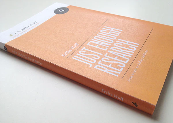
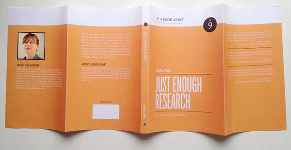
As we continue to expand the library, we’re pleased to announce that we’re improving the quality and format of our paperbacks. Starting with our very next title, Just Enough Research by Erika Hall, we’re introducing a higher quality print stock, lay-flat binding, and a double gate cover. To best present the new format, and equally exciting to announce, we’re updating the cover design — don’t worry, the hues will keep coming!
More sustainable printing
We want to keep delivering great content in the best physical form. Our books will weather wear-and-tear with a bit more gusto, and we’ll use less packaging getting them to you. We’ll also print new books using FSC certified paper. Higher quality often means higher costs, but we’re keeping our prices steady. All new title releases starting this summer will ship in the new format, and we’ll start to reprint existing titles in 2014. That means the complete library, as well as some bundles, will vary in design and format for a little while. To help with the transition, new discounts will apply when you purchase multiple paperbacks.
A simpler design
We love that our books stick around on shelves for future reading and reference, but there are a few things we wanted to improve in our paperbacks, both in terms of paper quality and design.
To start, we’ve tightened up the design of the exteriors a little. Covers now have simplified type colors, and french flaps to better protect the book as well as serve as a handy bookmark. New paperbacks will sport a lay-flat binding so that you can easily keep them open on your desk without breaking the binding. Book spines now display the full title, author, and series number—the previous cutoff title treatment wasn’t a mistake but a design limitation we had to concede from our first printing.
Additionally, as the various Apart platforms have matured, their visual identities don’t need to overlap as much as before. So, we’ve revised our logo ever-so-slightly to stand on its own.
![]()
Old and new logo comparison. The new logo uses Yoga (our body text typeface) and sports a cleaner laurel branch.
We’ve also increased our printing specs to five colors, allowing us to specify a Pantone color for each book’s signature hue and to ensure consistency through all printings. Lastly, the interiors will stay the same, but will be flanked by fancy endpapers.
Paper mockups of the updated design.
We’re incredibly excited to share these changes with you. We hope you’ll continue to read, reference, reread, share, and enjoy all the A Book Apart books!