
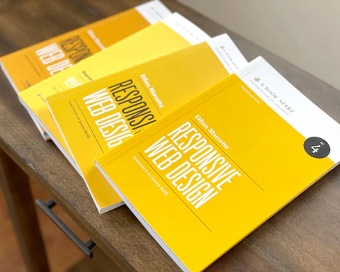
🎉 Celebrating 10 years of Responsive Web Design
Jun 11, 2021
🥳 Ten Years of RWD with Ethan Marcotte
Well, that was fast! We're celebrating ten years of Responsive Web Design this week with a fresh take from Ethan Marcotte. (Happy tenth to that little yellow book!) Take a look back (and ahead!) as Ethan reflects on what inspired Responsive Web Design, what we need to reckon with as designers, and how a grandmother’s advice lives on today.
ABA: When did you first know you wanted to write Responsive Web Design? What was the ignition spark?
Ethan Marcotte: I’m not sure I can point to one specific thing, honestly.
I will say that ever since reading John Allsopp’s “A Dao Of Web Design” early in my career, I was inspired by the idea of the web as a flexible design medium—something that could be accessed from any kind of device, and rendered on any screen resolution. Even twenty years on, John’s article still feels like one of the most important pieces ever written about the web.
Fast forward a decade or so later, I was working on the talk that eventually became an article (and later, a little yellow book), and I didn’t know what to call this technique I’d cobbled together. But thankfully, my partner told me about this cool architectural flourish she’d stumbled across. I started reading more about this more interactive form of architecture, then found some articles where they referred to it with a different name: responsive architecture.
Ten years on, those are the two sparks I think of first.
ABA: What has been the most significant change in the discipline of design you’ve seen emerge since the book came out?
EM: CSS Grid Layout comes immediately to mind, I suppose. It hasn’t just been a new way of building the same fluid layouts I made before: CSS Grid’s rewired the way I think about creating layouts for the web. And what’s more, I can rely on media queries less for managing layout breakpoints. Media queries are still indispensable for my work, but I’ve loved seeing the way I use them change.
(I’ll say that if you’re looking to learn more about CSS Grid, Rachel Andrew’s resources and writing have been a massive influence on me here.)
But honestly, it’s hard to pick just one change! The responsive work I do today looks dramatically different than it did a decade ago. It’s different than it was one year ago: I like saying that the three ingredients of a responsive design—fluid grids, flexible images, and media queries—haven’t really changed, but everything around those ingredients have changed in a million different, wonderful ways.
ABA: Why was it important to put this book out, with its specific thesis, in 2011?
EM: I mentioned John Allsopp’s “A Dao Of Web Design” before, but for the decade or so that followed, our industry wasn’t really thinking about the web in device-agnostic terms. And we definitely weren’t designing flexibly: by and large, we were creating pixel-precise layouts that were optimized toward desktop displays, and usually targeting a minimum screen resolution.
This worked great until mobile broke everything.
Of course, “mobile” didn’t really break anything—it just showed us what we’d broken. By assuming that we could control how, when, and where our designs were accessed, we’d been limiting the reach of our designs, and pushing away an entire class of users.
This is basically how the concept of “responsive web design” got its start. A couple years before the article came out, I’d been working on a string of projects that asked me to work on separate, standalone mobile websites. Not even that, really: I’d often be asked to provide “an iPhone website.” Of course, those sites would invariably be stripped-down, feature-limited versions of the desktop website—the “real” website. And something about that push for “mobile” websites didn’t quite feel right to me. It definitely didn’t feel sustainable: I mean, were we supposed to keep creating separate websites for every new device that came along?
By this time, I’d already written about a technique for creating complex and flexible grid-based layouts; others had already popularized approaches for making flexible images; and when I first read about media queries, well, I realized those three ingredients might make for something really, really interesting.
ABA: What’s one thing you want designers to reckon with right now?
EM: Oh, this is a good question, but it’s a hard one.
If I can pick just one thing, it’d be for designers to take a hard, critical look at the biases baked into our design tools. Because every tool has a set of assumptions baked into it, which can easily shape the design of products built with them. For example, if a design tool only works properly when there’s a persistent network connection, what kind of expectations does that create in the design team? Will they start to assume their users will always be connected too? Does an image production workflow only produce high-density images? If so, how does that impact any users who might be on limited or PAYGO data plans?
The point of these questions isn’t to find fault with the applications we use. It’s in effort to surface any implicit assumptions and biases baked into the software and, in doing so, to recognize that every tool shapes the task. Our design tools change the design of our products and, at times, they can change us.
If I could pick two things? Well, I’d urge designers—as well as developers, researchers, content strategists, and all other workers in the tech industry—to organize their workplaces, and to form unions.
ABA: Is there anyone you’re following the work of right now, who you’d recommend others pay attention to?
EM: Oh my goodness, so many people are doing work I find inspiring. I’ll give you two names, but please keep in mind that the list is much longer than that.
First, Lynn Fisher! Every year she does a stunning responsive refresh of her homepage, and I’m always in awe of what she pulls together. Seriously, take a spin through her redesign archive, and resize your browser window on each of her designs. Personally, I think each piece is a little responsive masterpiece. But for me, it’s not just about the (considerable) skill involved—there’s so much playfulness at the heart of each redesign. And I love that: for me, Lynn’s redesigns are a reminder that modern responsive design doesn’t need to be constrained by frameworks. There are plenty of opportunities for experimentation and joy, if we look for them.
Secondly, I’m also inspired by Resilient Coders, a Boston-based non-profit working to address the tech industry’s deep-seated diversity and equity issues. They train young people of color to become software engineers, and then they connect graduates with good, well-paying jobs in the tech industry. I’ve volunteered with them a bit over the last few years, and I’m so impressed by the bootcamp, by the students I’ve worked with, and by the team and community that Leon Noel and David Delmar Sentíes have built. If your company’s in a position to hire a graduate, do; and if you can donate to Resilient Coders, they’re doing important work that’s worth supporting.
ABA: What is your go-to source of inspiration when you’re trying to get out of a creative rut?
EM: I can hear a few close friends rolling their eyes right now, but I listen to Ursula Franklin’s Massey Lectures when I’m feeling stuck. I dearly, dearly love reading the book that the lectures eventually turned into, but Franklin’s voice has a bracing, inspiring quality to it. But however you choose to read or hear her words, they’re a remarkable look at technology not as an abstract concept, but as a social force—one that shapes people’s lives.
ABA: Is there a fear that keeps you up at night? What is it?
EM: Grizzly bears.
ABA: What tool, object, or ritual could you not live without to get you through a week?
EM: I go running three times a week. I am, to be clear, not a fast runner, much less a “good” one. (Whatever that is.) But in the last few years I’ve gradually worked up to running longer distances, and I’m proud of that. And getting some time outside—with a good audiobook in my ears, with no screens in sight—has become something I really look forward to.
ABA: Is there a piece of professional or life advice you’ve gotten that has always stuck with you? What is it?
EM: My grandmother once told me, “You should offer praise in public, and offer gentle criticism in private.” She said a lot that shaped the way I approach the world, but I think about that particular suggestion a lot.
•••
Learn more about all our authors—check out the rest of our Meet the Author series!
Have you picked up your copy of Responsive Web Design yet? Complete the set when you pair it with The New CSS Layout and save 10% (15% when you buy paperbacks & ebooks)!